
Introduction
Most businesses are constantly looking for ways to improve the effectiveness of their marketing campaigns. One way to do this is to target customers with the particular offers most likely to attract them back to the store and to spend more on their next visit. In other words, the marketer’s goal is to make the most suitable match between customer and offer. Market segmentation helps them just to achieve that goal.
I am assuming the average reader knows about market segmentation hence I will not go into detailed explanations but we will be covering most of them during our hands-on experiments here.
Demographics segmentation is one of the most commonly used forms of market segmentation. In this article, we will explore some effective methods of demographics segmentation analysis.
The Dataset
Let’s get started. We will use the market data available from the Stanford website. This data is an extract from a survey containing 502 questions filled out by shopping mall customers in the San Francisco Bay area.
It consists of the following 14 demographic attributes: Annual Income, Sex, Marital Status, Age, Education, Occupation, Years living in the area, Dual income, Persons in the household, Persons in household < 18, Householder status, Type of home, Ethnic classification, Most spoken language
Note: if your customer dataset doesn’t have demographics variables, you can easily add it using external sources like Acxiom, Nielsen etc.
Explore dataset
We will mainly be using python, pandas, and matplotlib for our analysis here but you are free to try the same with any other framework.
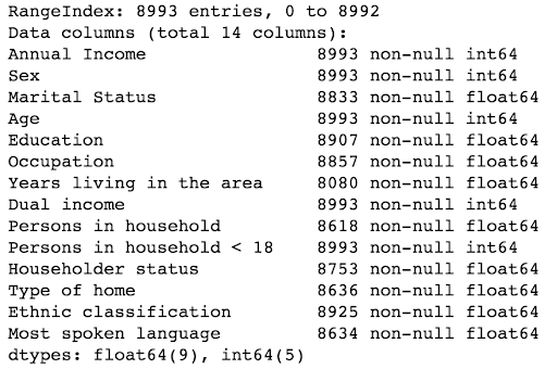
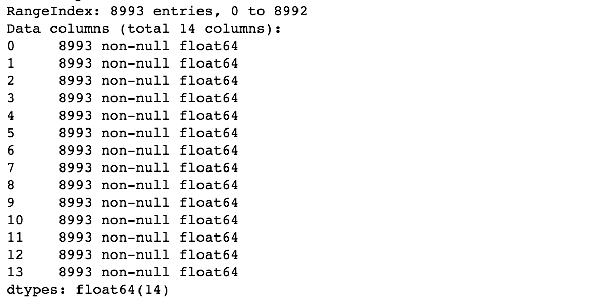
We’ll start by looking at the data.
 The stats above reveal some attributes like marital status, occupation etc have null values. We will fill the null values later on.
 It is quite evident that we have several numeric attributes for customers. Each row belongs to a customer and the values are given by customers during the survey. You can check out this link to understand each attribute in detail but the names are pretty self-explanatory.
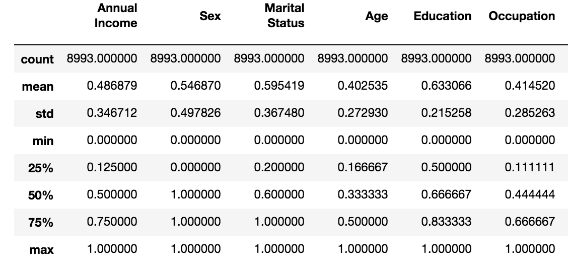
Let’s do a quick basic descriptive summary statistics on some of these attributes.
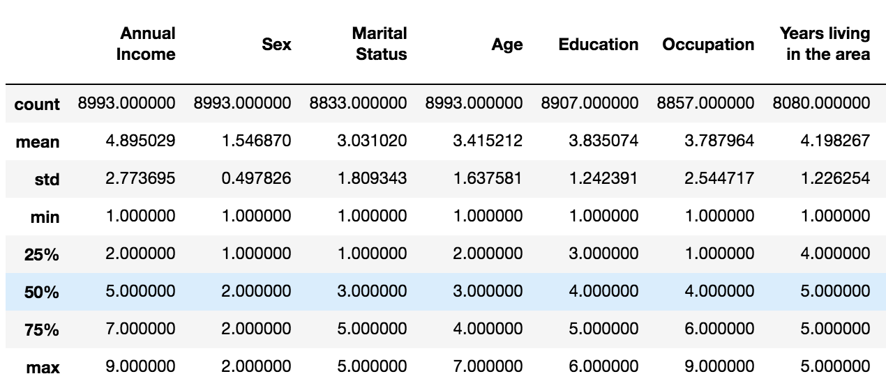 It’s quite easy to contrast and compare these statistical measures. Notice the difference in max among the attributes. Later, we will do feature scaling through standardization, which is an important preprocessing step for many machine learning algorithms.
One of the quickest and most effective ways to visualize the data and their distributions is through histograms.
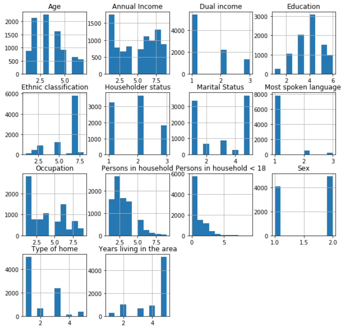 The graphs above give a good idea about the basic data distribution of any of the attributes.
Machine Learning Algorithm
One of the simplest and popular ways to do clustering (or segment), is to use unsupervised machine learning algorithm, K-means. The goal of the K-means algorithm is to find groups in the data, with the number of groups represented by the variable K. To find the number of clusters in the data, we need to run K-means clustering algorithm for a range of K values, compare the results and pick the optimal K value.
Prepare data for machine learning
Machine learning algorithms learn from data. So, it is important that we feed them with the right data. We need to make sure that our data is in useful scale, format and even that meaningful features are included. Based on our data exploration earlier, we know it contains null values and attributes with different scales.
Let’s fix our data by filling null values with 0 and using MinMaxScaler.
 We can see that both null values and max measure are fixed now.
One variable segmentation
Demographics segmentation based on one variable is perhaps the simplest form of market segmentation. Let’s run the K-means algorithm for a range of K values (2-20) with data containing 1 variable (sex) only. One of the methods to determine the optimal number of clusters in k-means clustering is to use elbow method.
Let’s plot the distortion (or percentage of variance explained) by the cluster against the number of clusters.
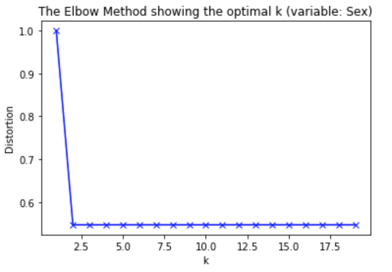 It is quite evident from the above plot that after K=2 adding another cluster doesn’t improve much. So, the number of clusters chosen should, therefore, be 2.
Multiple variables based segmentation
Multiple variables are where the fun, as well as the complexity, begins. Here we use all 14 attributes in our data to perform demographics segmentation analysis.
Let’s rerun the K-means algorithm for the same range of K values (2-20) as before but with data containing 14 variables.
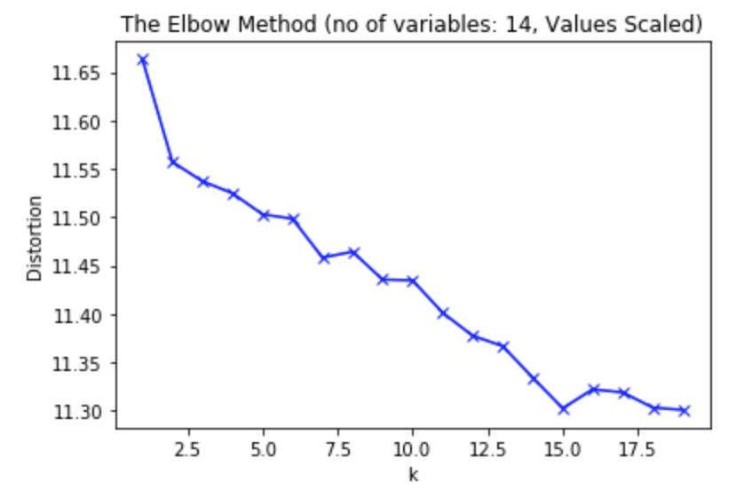 Based on the above plot, you can see 15 is the optimal value for K.
An important point to note about elbow method is that it is not always possible to pick the optimal value using this method.
Another way to find optimal value for K is to leverage silhouette analysis
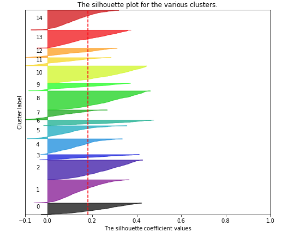 Basically, in this visualization as depicted above, each color represents a cluster, its thickness denotes the cluster size. The red dotted line represents the average silhouette coefficient. Just by looking at it, we can clearly see that the silhouette coefficient of all the clusters is above average. Also, some clusters (3, 7, 9, 11, 12) are very small as compared to other clusters (1,2,8,13,14).
For a good cluster, silhouette coefficient will be close to 1 and similar in size compared to other clusters.
Understanding Clusters
At this point, we have clustered customers into our 15 clusters. With our K-mean clustering model, we can produce a list of all customers and which cluster they belong to. So, we can take a specific cluster and study the customer characteristics along known dimensions.
Let’s study the customer characteristics of cluster #1. Essentially a histogram works quite well in understanding how the data is distributed for each attribute.
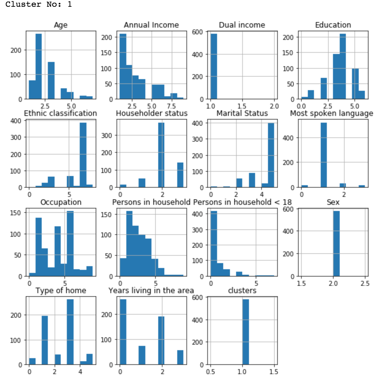 As you can see, customers in cluster #1 are English speaking, single white female, 18-34 years old, with income less than 10,000 and graduated from high school or 1-3 years of college with no persons < 18 in a household.
One of the best ways to check out potential relationships or differences amongst the different clusters is to leverage parallel coordinates. Let’s prepare cluster level data and the count of each attribute value.
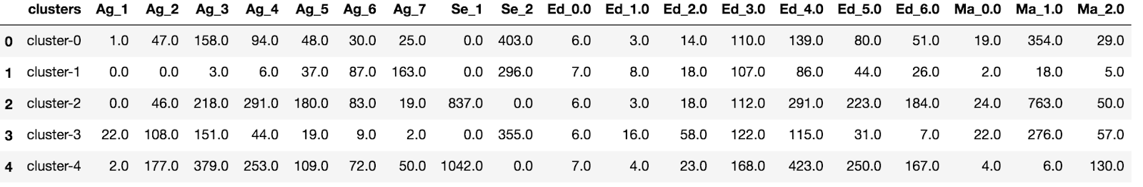 As you can see, we have limited our data to 4 clusters and 4 variables just to keep the plot easy to understand.
After standardizing the values, let’s visualize it in parallel coordinates plot.
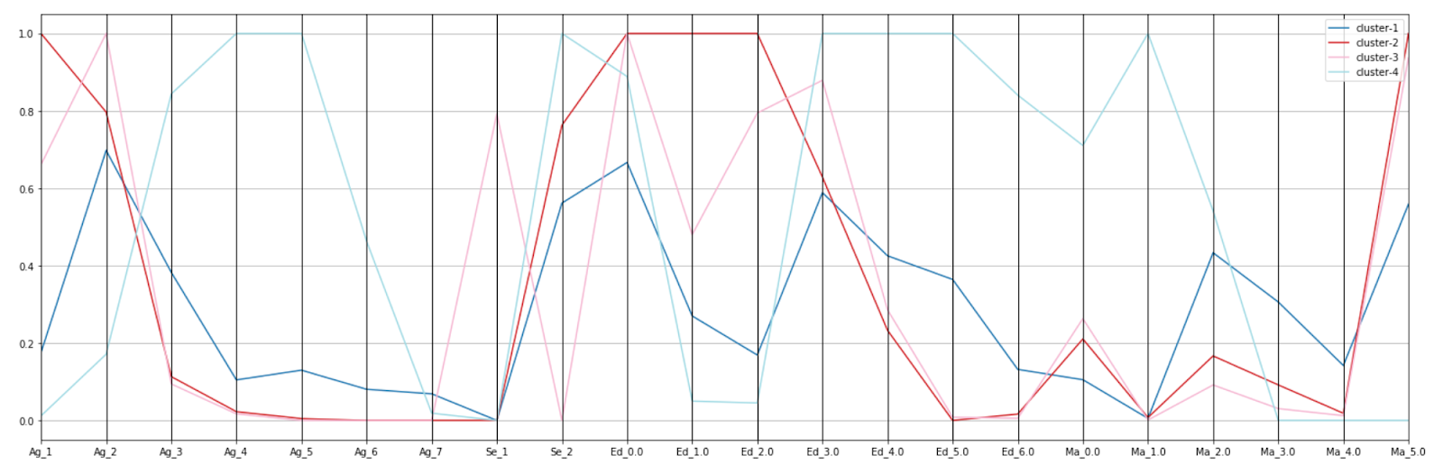 In the plot above, X-axis represents the variable value (Ag_1 represents Age with value 1) and Y-axis denotes the standardized count of the values.
Based on the above plot, we can come to the below conclusions:
- Cluster 2 is younger age with less education and single (going to school)
- Cluster 4 is middle aged with higher studies and married
- Cluster 1 is young, female, living together or single
- Cluster 3 is young, male, single
Conclusion
Once we determine which dimensions mattered in separating our clusters, we are likely to gain insights about new behaviors or to validate existing assumptions. Hopefully, these observations are significant and actionable.
When it comes to clustering, we are rarely done after we pick the optimal number of clusters and run the algorithm. Hence I will cover more strategies of demographics segmentation in future columns.
Did you find some great strategies of your own?
Let us know in comments.