Introduction
We covered basic strategies of demographics segmentation in the previous article in this series. In this article, we will explore additional strategies to improve the quality of market segmentation and reach your target market more precisely.
“Who, precisely, are you trying to reach?”
-Seth Godin
Missing data
Missing data is one of the most common problems faced by the researchers. If the missing values are not handled properly, then we may end up with inaccurate market segments.
As you know, our dataset is a survey data hence not all participants will respond to all the questions. Do check it out for a quick refresher if necessary.
One of the simplest and more structured (than guessing) methods to handle missing values is common-point imputation. In this method, we will replace missing values with the most commonly chosen value.
We’ll start by displaying the summary count of missing data by column in pandas using isna() method.
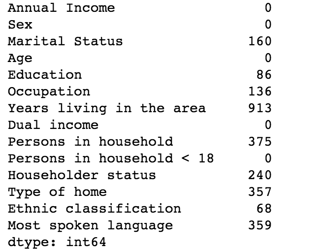
It is quite evident from the above stats that there are missing values in multiple columns.
Let’s visualize attributes using the histogram, which works quite well to find the most commonly chosen value.
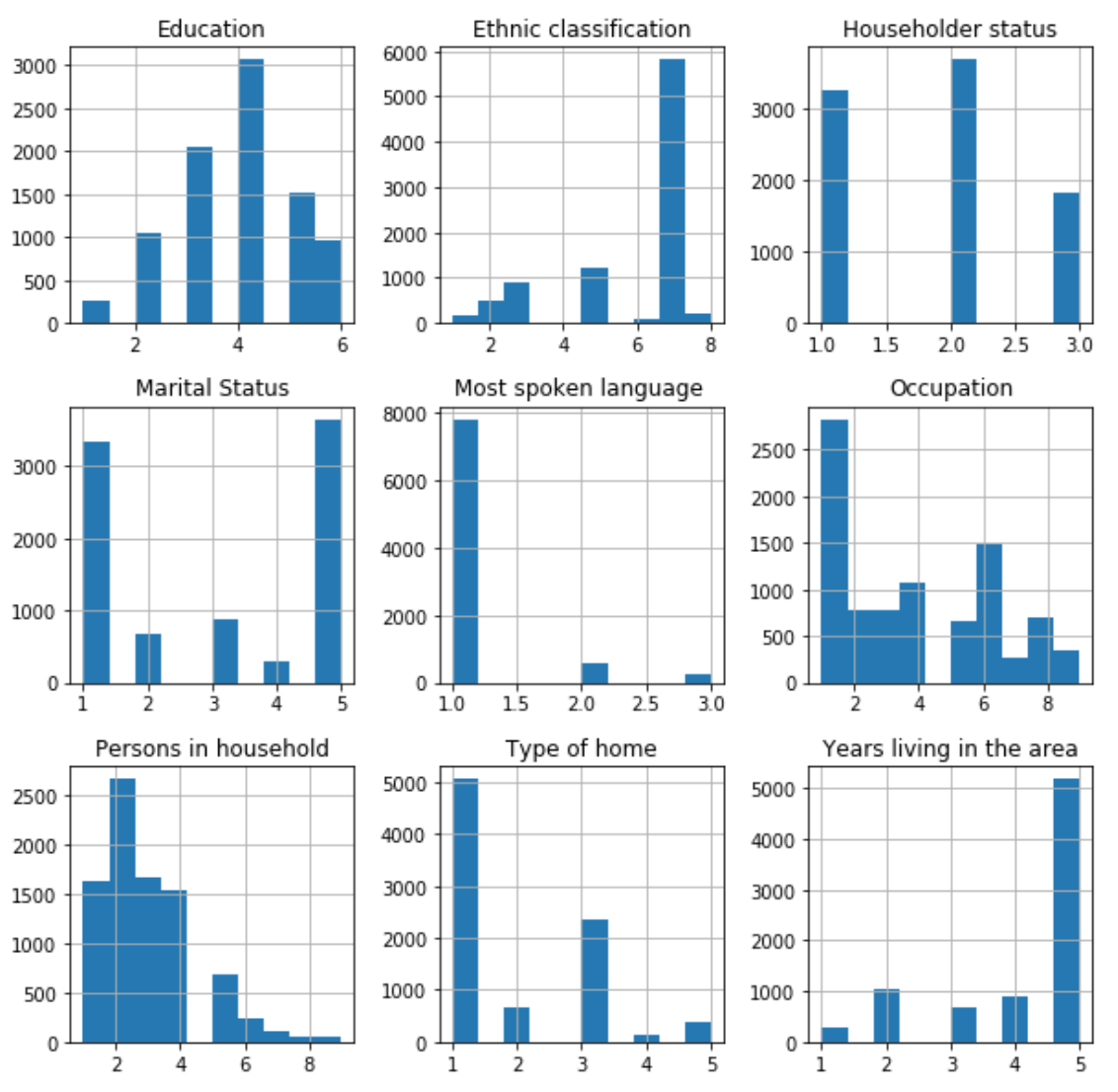 Based on the above plots, we can arrive at the below commonly chosen value report for data attributes.
| Column | Commonly Chosen Value |
|---|---|
| Education | 4 (1 to 3 years of college) |
| Ethnic classification | 7 (White) |
| Householder status | 2 (Rent) |
| Marital Status | 5 (Married) |
| Most spoken language | 1 (English) |
| Occupation | 1 (Professional/Managerial) |
| Persons in household | 2 (Two) |
| Type of home | 1 (House) |
| Years living in the area | 5 (More than ten years) |
Let’s take a look at the descriptive statistics after replacing the missing values using the above report.
 As you can clearly see, there are no more missing values in the dataset.
Common-point imputation vs zero fill
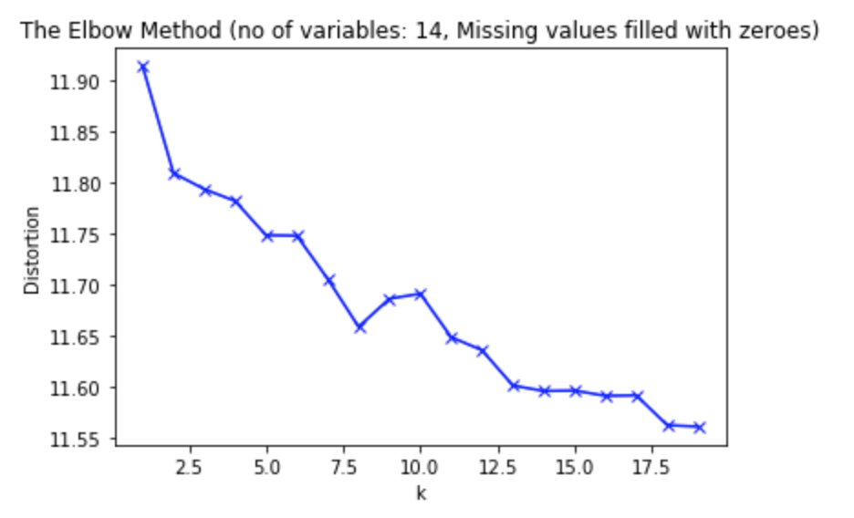
Let’s run the K-means algorithm for a range of K values (2-20), with missing data replaced with zeros.
Let’s visualize the elbow method for k-means clustering.
Let’s rerun the above K-means algorithm with missing values replaced with commonly chosen value.
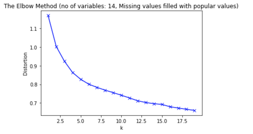
It’s quite easy to compare the above two elbow methods for zero fill and common-point imputation. Notice the difference in the distortion.
It is important to note that good clusters will have less distortion.
Another way of comparing the clusters quality is to use the silhouette score chart.
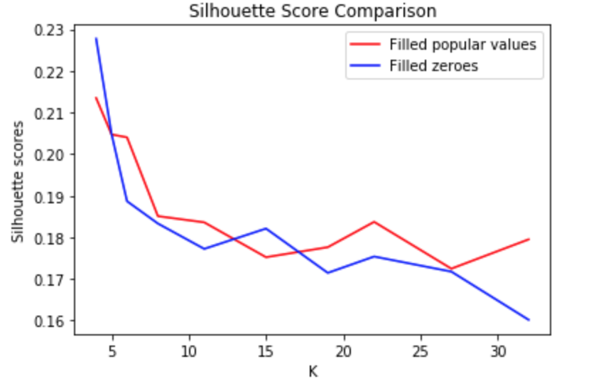 As we can see, common-point imputation technique does improve the silhouette score. We will use the dataset replaced with the commonly chosen value for the rest of this article.
Better Cluster
Let’s rerun k-means clustering for a range of K = (2,10) and visualize the elbow method.
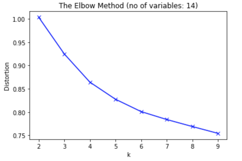 Notice how the chart above does not have a clear elbow. Instead, we see a fairly smooth curve, and it’s unclear what is the best value of k to choose.
It is important to note that no elbow in for K-means does not mean that there are no clusters in the data. No elbow means that the algorithm used cannot separate clusters.
In cases like this, we either have to try a different method for determining the optimal k, or we need to reevaluate whether clustering is the right thing to do on our data.
We have been using all 14 variables of our data to do market segmentation. Instead, let’s try to find and use the variables that will work best for our demographics segmentation.
One of the simplest and most effective methods to find the best variables is to start with 1 variable (sex) and keep adding another variable that keeps the distortion to a minimum.
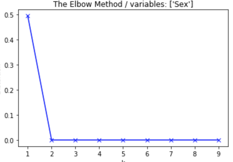
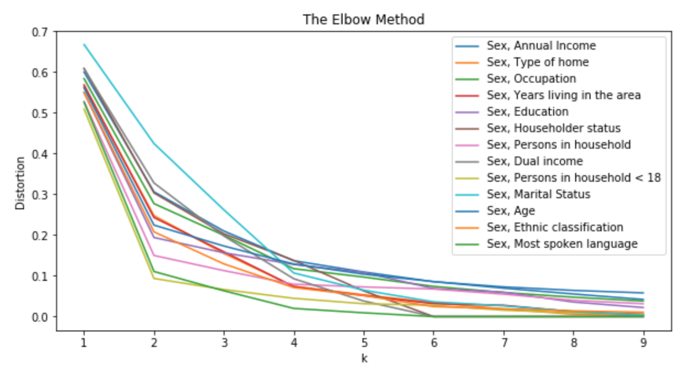
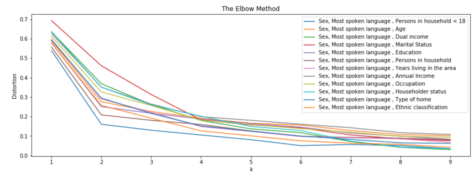
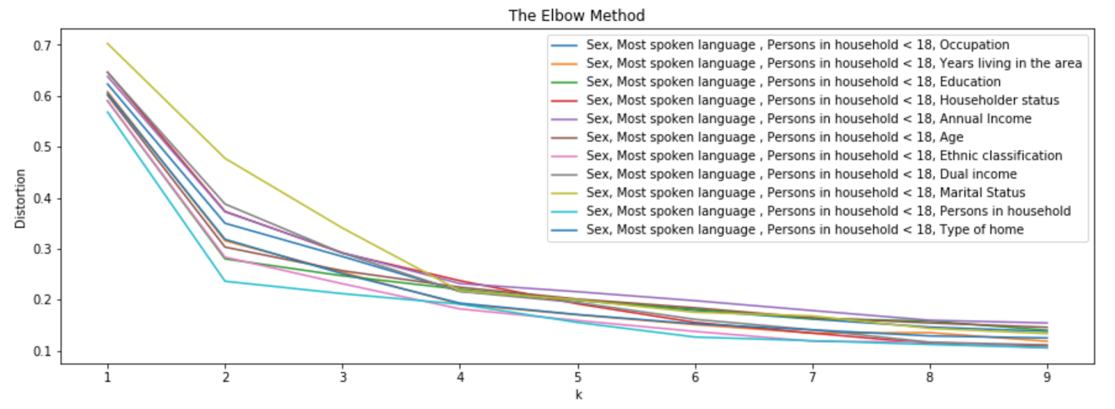
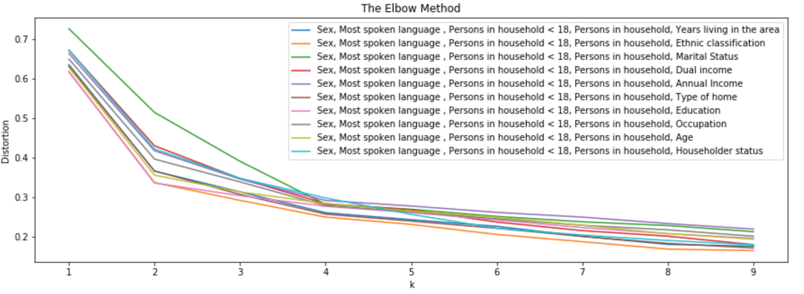
Basically, in the above 4 visualizations, each one represents a k-means clustering with variables specified in the legend. We start with variable sex and keep adding another one that gives less distortion. As you can see in the second visualization, sex and most spoken language combination give less distortion. So, we add the most spoken language and continue with the next variable. Also, we picked ethnic classification and marital status in the last step, because marital status displays a clear elbow than the rest of them.
Let’s rerun k-means clustering with 6 variables chosen in the previous experiment and visualize the elbow method.
 This definitely displays a clear elbow and you can pick the optimal value for K as 4.
One of the best ways to understand the characteristics of the cluster is through histogram.
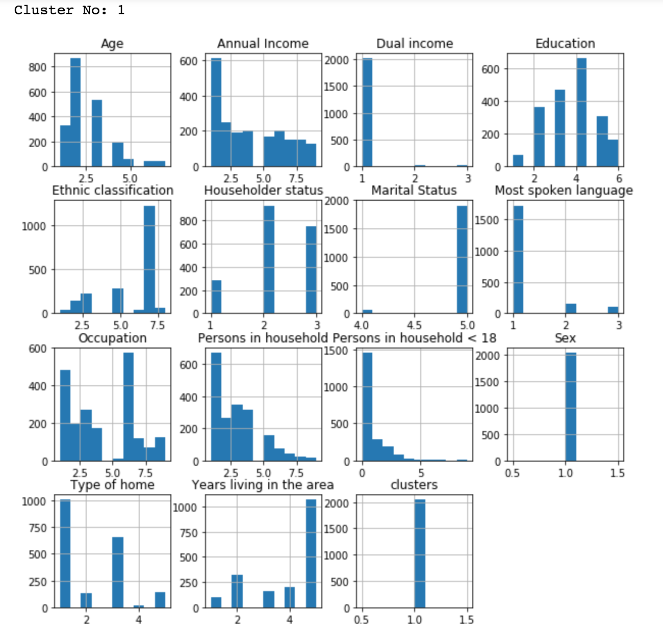
Using the above plot, we can summarize the customer characteristics in cluster 1 as English, white, male, not married, single or never married.
Now, let’s compare all the clusters using a parallel coordinates plot. As in the previous article, we have used 4 variables to keep the plot clean and easy to understand.
 You can see the plot generated above is clear and we can compare across the clusters easily. Also, based on the above plot, you can clearly observe the following cluster characteristics.
Cluster 0: Male, Married, English, White
Cluster 1: Female, Single, Never married, English, White
Cluster 2: Male, Living together or Divorced, English, White
Cluster 3: Male, Single, English, White
While this is a good way to visualize multiple clusters, as you can see, sometimes clusters overlap which makes it hard to identify the characteristics.
Another common visualization is heatmap, which is another effective way to compare the attributes across the clusters.
Let’s visualize one heatmap each for annual income, sex, marital status, age, and most spoken language.
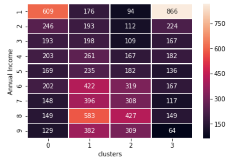
It is evident from the above graph that cluster 0 and cluster 3 have low-income customers whereas other 2 clusters have high-income customers. Check the details of data attributes here, if necessary.
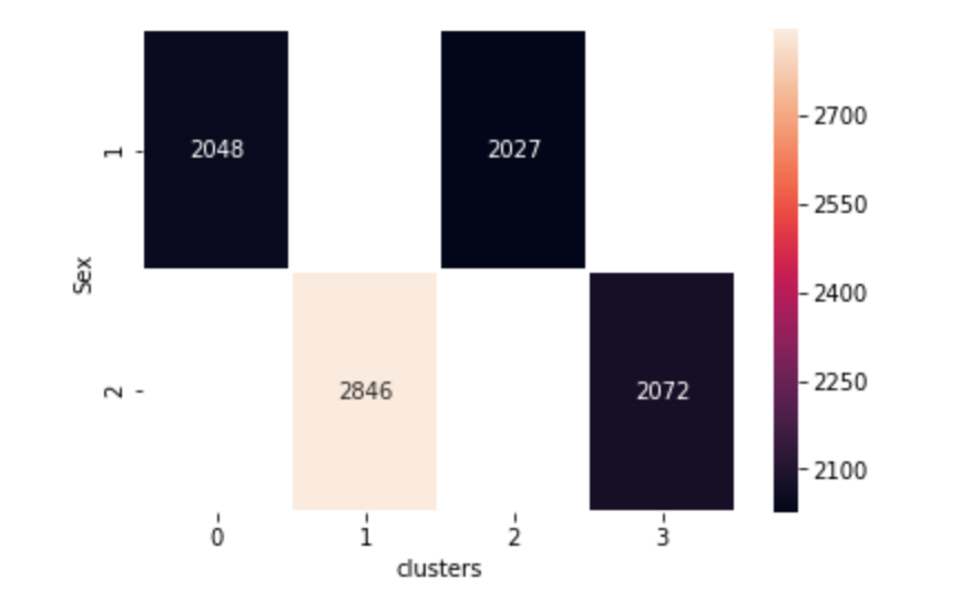
You can clearly see males and females are split into 2 clusters each.
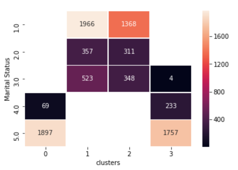
You can see cluster 0 and 3 are widowed or single and cluster 1 and 2 are married, living together or separated.
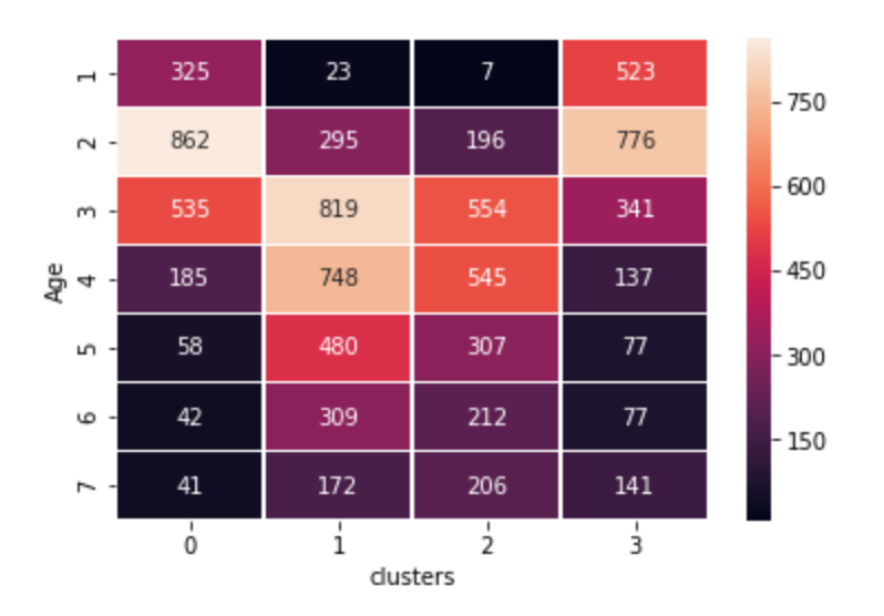 The above plot enables you to find cluster 0 and 3 have young customers whereas cluster 1 and 2 have middle to old aged customers.
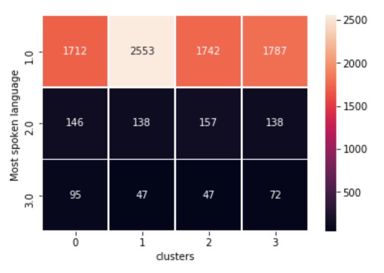 As you can see all our clusters have mostly English speaking customers because our data is dominated by the English language as shown in the previous article.
Conclusion
These examples should give you a good idea about additional strategies for improving the quality of market segmentation. If you read Part 1 of this series, you would have seen a different way to explore and understand the dataset. We also talked about one variable and multiple variable based segmentation. It is important to note that the techniques shown here highly depend on the data. When a specific method doesn’t work, you may consider:
- Tune your algorithm
- Use another algorithm
- Do data preprocessing
- Remove unimportant variables
We will cover more methods in a later article.
To read the first part of this series, check out A Practical Approach to Demographics Segmentation - Part 1.


